In a previous post, we explored some basic concepts of Unreal Motion Graphics – what it is, basic elements, and how to build a basic UI. In this post, we’ll take that a step forward and learn how to create modular UI elements.
Creating a Button
To start off, we’ll create a button that has preset image, on hover, and on pressed states.
- Create a new UI Widget. Right click on the content browser and go to UI -> Widget
- Name the Widget
WB_Button. - Open the widget and build the basic button. Search and drag a Button element type to the designer, then find and drag a text element on top of the Button element to stack them.
- To make the button appear more like it will by default, click the Fill Screen button in the top right of the designer and select
Desired.

Making variables
- Select the Text Block and check the
Is Variablebox in the Details panel. This will allow us to change the text displayed on the button. - Do the same thing for the
Buttonelement, so we’ll have access to click events later.

(Optional) Name the variables something meaningful
Update the names of the Text and Button elements to something more meaningful – I used the simple ButtonElement and ButtonTextElement names. This helps make it easier to understand when referencing variables, especially if you have a UI element that has multiple elements of the same type, such as multiple text fields.
Exposing the variables
By default, if you take the UI element now and place into another UI, you won’t have access to these variables. So we’ll have to do a few more things to expose the variables to any Widget that uses them.
Expose the button text variable
- Go to the Event Graph for the button (top right by default)
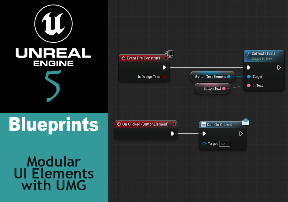
- The
ButtonTextElementvariable should be visible in the My Blueprint panel (top left on default). Drag this element out and chooseGet. - From the
ButtonTextElementvariable, drag and find aSetText (Text)node. - Create a variable to update the text. On the
In Textpin on theSetTextnode, drag and selectPromote to Variable. - Rename the variable to
ButtonText. - In
ButtonText‘s details panel (default bottom left), select theInstance EditableandExpose on Spawnboxes. This allows for modification of this variable from another Widget Blueprint. - Connect the
SetText (Text)node to theEvent Pre Constructnode. Event Construct would also work, but using PreConstruct allows for seeing the text updates whenever you compile Unreal.

Expose the button click event
- Go back to the Designer and select the Button Element.
- Scroll down to the bottom of the Details Panel. There will be an
Eventssection. Several actions will be listed with a + button next to them. Click the + next toOn Clicked. This will create a On Clicked (ButtonElement) event in the Graph. - Create an event dispatcher called OnClicked. Drag to the graph and select
Callthen connect to the OnClicked(ButtonElement) custom event. (To see more on Event Dispatchers, check out my previous post on the topic).

Use the button in another UI Widget
- Create a new UI widget by right clicking on the content browser, User Interface -> Widget Blueprint
- Drop a
Canvas Panelelement onto the Designer - Search, or look under the User Created section of the Palette for your button and drag onto the canvas.
- Set the text. Look in the Details panel and under Default near the top will be a Button Text field. That’s the field we exposed. Input your text.
- Set the click event. Scroll to the bottom of the Details panel. Under Events you’ll see an
On Clickedevent like when we exposed it. Click on the + and set up your event.
Customize the button
Now feel free to customize the button – import different images for the various button states, change tints and font type or size, and watch these changes populate to every instance of the button that exists within your various UI elements.
Apply to other UI elements
Now, tarry forth and explore this wonderful, time saving modular UI world with a wide variety of UI elements!
Personally, I’ve used it to create a game timer, Start and Exit game buttons on a main menu, and am currently building up a few other UI elements using the principles discussed here.