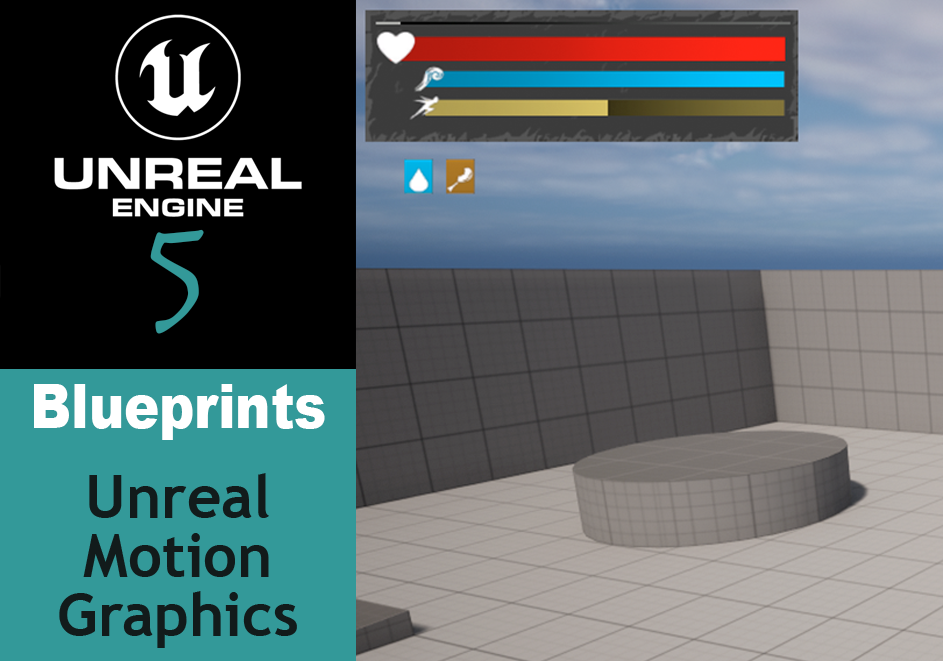
So far, I’ve created a few super basic HUDs for the sake of displaying stats on the screen to validate logic around them. But these basic HUDs are just that – basic. A few bars that are color coded and hooked up. It does the job, but I wondered what else the system could do. So here’s what I’ve learned about UMG – Unreal Motion Graphics Interface.
Building the Interface
The Pieces
There are many pieces that Unreal gives you to build a UI, and too many to go into right now, but some of the key ones I’ve had need of and easily see use for are the following:
- Canvas Panel just exists to give you a place to put your UI elements
- Text is exactly what you think – text to display on the screen. This can be turned into a variable and updated in a variety of ways and has the typical text modifications of font, size, typeface, etc.
- Progress Bar is a rectangle with a background and fill color. You can set either/both to use specific images to set up a variety of bars – health, stamina, etc. The directional can change from left/right to inside/outside etc. The fill is determined by a float from 0.0 – 1.0.
- Button an interactable element, as you’d expect. You can set color/images for default, clicked, hover, disabled, pressed and released. If you drag a text to a button it will be auto centered.
- Image defaults to a white box. You can set it to display custom images.
Building UI
Once you have your images in place you need to anchor them relative to a point on the screen.

Anchoring elements will help ensure they stay roughly where you wanted them when looking at different size and resolution screens. This is especially important when you have buttons or text on specific images and need them to stay in the same place relative to each other. To do that, once you’ve set your anchor preset, update the position x and position y variables to 0 so they line up where the anchors are. Afterwards, you can move them where you want and ensure they’re relative to that anchor.
Alternatively, you can use the shortcut shift + ctrl to anchor and auto align selected elements to the bottom center of the screen.
Importing Images
Unreal supports the import various image types.
- bmp
- float
- jpeg
- jpg
- pcx
- png
- psd
- tga
- dds
- exr
- tif
- tiff
In my own attempts to import images, I had very mixed results using png – sometimes the transparency wasn’t transparent, sometimes it was there but the asset had a white outline, and sometimes the image was tinted red. I couldn’t quite figure out why (although read somewhere it may have something to do with alpha channels) so I moved on to using other types.
Since I was surprised that psd was available (photoshop files), I went ahead and gave that a go and it works great. I do worry a bit about what that means for file sizes of the image assets but I didn’t have any of the other issues I’d had with png.
As far as dimensions, Epic recommends using images sized by a power of 2 (32, 64, 128, 2048 etc) and the engine doesn’t support larger than 8192 by 8192.
Adding Images
With an element selected, such as the progress bar or image types, for the image type, you can add custom images under an Image section in the details.
- For the Image UI element type, this will be under Appearance -> Brush.
- Progress Bar will be under style and have both a Background and Fill image you can set.
- Button will be in Appearance -> Style and under each button state: Normal, Hovered, Pressed, Disabled.


Whenever you’ve set an image, make sure to change the Draw as type to Image otherwise some funky (in this context) behaviour may occur.
Altering Images
Borders. A neat thing to know is that the border Draw as style is great for having the engine repeat patterns for your graphical borders. This makes it a good idea to break up more complicated images into different pieces so you can take advantage of border repeats and other functionalities.

Image Tint. If your images are white, you can also set tints to them in the details. This gives you flexibility with some more advanced blueprints to modify them as needed – so if you’re using the same look just different colors for different elements, this allows you to just make the one image and modify as needed. Also note that buttons have a tint by default, so if your image looks weird, set the tint to 1.0 for each color channel!

Converting Images to UI Materials
Instead of using the image as an image type, you can convert it to a Material and apply the material to various UI elements.
- Import the image you want to use
- Find the image in the content drawer, right click and select Create Material
- Name the new material and open it up
- In the Material editor:
- Set Material Domain to User Interface
- Set Blend Mode to Translucent
- In the Material Graph, connect
RGBtoFinal ColorandAtoOpacity - Save and close the editor
Now the material can be applied to other elements, such as an image or border. When doing this, make sure the add a margin to the element after the image has been applied (such as 0.5), set the Draw As to box and set the image size to the minimum size of the element. Once you’ve compiled the blueprint, you can see it do things like repeat the border (much more neatly than our earlier image did).
Layering the Elements
When toying around with the various elements available in UMG, you may have noticed that sometimes an element, such as a background, is sitting on top of the elements that it should be behind. There is a way to control that – in details, there is a ZOrder option set to 0 by default. Using this, you can control which elements are on the top or bottom. The higher the number is, the higher in the z order it’ll be and thus closer to the top. The lower, will force it backwards. So if you had a few buttons and a background, where the background is on top of the buttons, you could set the ZOrder to -1 for the background and it would be pushed back where you wanted it.
Displaying the Interface
Now that you have the interface exactly how you want it, you still don’t have a way to see it. Well, there is typically one specific way to make the interface display on the viewport, but a few different places to put it.
The general idea when using blueprints:
- Create a Widget
- Set the
Widget Classto the UI you’ve created - Promoting the Return Value to a variable
- Passing that return value to an
Add to Viewportnode - Making sure the Owning Player (
Get Player Controller) is attached to the Create Widget node.

As to where this goes and what triggers it, that’s up to you and probably your use case. The places I’m aware of currently:
- On the Player Blueprint, added to the
Event BeginPlaynode. If you see my other post about Setting up a HUD this is the way that I set up the HUD there. - On the Level Blueprint. Like the Player Blueprint, add to
BeginPlay. - In the World Settings. In the Editor, click the Settings button on the top right and select World Settings. Under Game Mode expand Selected GameMode. You can update the Hud Class to the widget you created.
Updating UI Data
There are also a few ways that you can update the data displayed in the UI, be it numerical values, updating a progress bar or otherwise.
- Import and reference the HUD. You can see an example of this in Setting up a HUD. There, I create a HUD widget in the ThirdPersonCharacter blueprint, then created a variable for the player character in my PlayerStats blueprint which allowed me to grab a reference to the HUD and it’s various elements as things were modified.
- Create a Binding. You can bind a variable to an element in the UI and it will automatically receive updates as the value changes. For details see Unreal’s UMG UI Designer Quick Start Guide under
Script: Health and Energy. In essence, you’ll click bind button next to a UI element value and it’ll open a new blueprint for you to modify. Import the character or whatever you’re trying to bind and set thereturn valueon thereturn nodeto the variable you want to track.
Best Practices
Check out Unreal Engine’s official best practice recommendations.
Wrapping Up
While this is a shift from the normal step-by-step walkthroughs I’ve been doing, this has been a necessary and informative journey in helping me improve my understanding of Unreal and in how I can start creating interesting UIs. In going through this, I built a player HUD inspired by Conan Exiles with some help from game-icons.net for the iconography.
